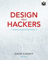
Rating: 8.0/10.
Book that breaks down the principles of design and explain the theoretical foundations of design aspects such as typography, composition, and color, meant for an engineer who likes to have rules to follow. The book is filled with images and graphics, making it a relatively quick read. It also provides interesting historical information about how design and fonts evolved. However, some of the recommendations are a bit outdated, with web examples from the 2000s and look quite different from more recent designs.
Chapter 1: Good design creates an experience with the desired emotional impact. To do a good job with design, you need to understand the layers of limitations and how the underlying product works.
Chapter 2: User experience design matches the product with the user’s characteristics and intentions. Visual design is important for some things, like shoes, but for utility items such as hammers is less important. Sometimes, the value proposition is strong enough that design is not necessary, eg, Craigslist; other times, design is crucial for the product’s success, like Apple. Start by defining the user persona and use case, and imagine what he’s thinking as he tries to do something (eg: when a user sees a reply tweet, he needs a way to find out what it is replying to). Sketch out a wireframe before going into any details.
Chapter 3: Fonts and typography. Why is Comic Sans a bad font? It is unmodulated, and this results in an uneven distribution of weight in light and dark for some letters. It also has a poor letter fit compared to more serious fonts like Helvetica, leading to awkward and uneven letter spaces. It was originally developed to work on highly pixelated screens, otherwise it is a rather poor font, but it was the default in early word processors, so it was used extensively by people without knowledge of typography.
Various forms of lettering were optimized for different media like brush, then printing, and finally pixels on the screen. Lowercase letters were only used since Emperor Charlemagne designed them for faster writing. The earliest printing press used letters that were based off written script, which was inefficient, so they quickly adapted straighter forms that were optimized for the steel cutting process of making letters. Garamond was a good font for printing, but Georgia made some adaptations to be more suitable for pixels: the lowercase letter heights were made taller, so it is more legible at lower resolutions.
Chapter 4: Impressionism was created in opposition to Neoclassical art. The advent of photography meant that artists no longer needed to appear as real as possible and rather desired more emotional qualities. Mac OS Aqua style revolutionized design in 2001 and replaced the older rectangular pixel style with rounded corners, shadows, gradients, etc, and many sites in the 2000s used a similar style. Make sure to design for SEO: decide what keywords to target using the Google search tool to gather information and optimize your URL, title, meta headings, and backlinks from reputable sites. However, do all of this in moderation so it does not get downgraded.
Chapter 5: Ratios and Proportions. The golden ratio is often considered a good proportion for many designs. However, the idea that the golden ratio is omnipresent in nature and art is more myth than reality; this claim is not really supported by evidence, as many ratios are something other than a golden ratio. More common ratios are 2:3 and 3:4, patterns of objects in consistent ratios appear pleasant, and it is good to use sizes that are 0.75 times each other in design.
Chapter 6. Principles of composition – in an ideal painting, the eye starts at the top left, is constantly drawn to something interesting as it is drawn across the painting. Foreground background: an active element should be designed with foreground, and should be brighter, have a drop shadow, and pop out visually in some way. Similarity means the repetition of similar elements throughout the design to be cohesive. Rhythm is an idea from music and basically means even spacing of elements. Use alignment to draw viewers’ attention in the direction of either left to right or top to bottom. The chapter finishes with an example of design principles in the Mailchimp logo, demonstrating how the composition principles are used.
Chapter 7: Use white space to communicate hierarchy. The top left element is seen first and is treated as the most important; an element with a lot of white space surrounding it is also considered important. Use font weight and size to adjust relative importance; size should go up in consistent ratios, and generally, don’t be so eager to switch between different fonts. As a last resort, use visual annotations like lines, but avoid using them too much, many vertical lines (like those in tables) are not really necessary.
Chapter 8: The human visual system performs some automatic color processing, so colors that are affected by shade are perceived as the same color. Visible light is a linear spectrum, but we perceive color using three types of cones: red, green, and blue. Opposite colors cannot be perceived simultaneously. Some people don’t have all of these cones, so it’s a good idea to simulate color blindness to ensure your diagrams are still legible.
Some color definitions, like HSB, are more intuitive than others, like Lab, for picking colors. However, the brightness in HSB is not consistent across colors due to perceptual differences. Lab is good for choosing a set of colors that match on perceptual brightness. In general, choosing a color palette with a formula is difficult because human perception of colors doesn’t always match the mathematical model, so it’s a better idea to use an existing color palette.
RGB is an additive color model using three colors that form white. This is usually represented in hexadecimal, so understanding it allows changing values without a color picker. Printing uses a different color gamut, CMYK, and an ICC profile tries to approximately convert RGB to CMYK. However, this is inexact, and some colors in RGB cannot be converted (out of gamut), and software will give a warning when this is the case.
Chapter 9: Humans have innate emotional responses to certain colors, eg: red and orange are more exciting, and red affects our cognition, making us less rational and more impulsive. In other cases, emotional responses to colors depend on culture, like associations with countries, national flags, or sports teams. Standard web color patterns include green for progress, red for error or urgent messages, and blue for links: be aware of these standards. Light and warm colors tend to pop out, while dark and cool colors recede into the background. Complementary colors work well for creating contrast, which is why black is less suitable as it does not offer this option. Color schemes with similar colors feel more calming and relaxing, while complementary or triadic schemes are more energetic. Desaturate or add some grays to prevent the designs from being too jarring.


