Rating: 7.6/10.
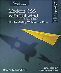
Modern CSS with Tailwind: Flexible Styling Without the Fuss by Noel Rappin
A short book of around 80 pages, covering the basics of Tailwind CSS, a modern utility framework. Tailwind simplifies various aspects of CSS, making a book on it relatively concise. While online documentations cover this content, having it presented in book format is useful to guide through the major features of Tailwind.
Ch1: How to set up Tailwind, and a basic example of making incremental changes by adding Tailwind classes.
Ch2: The basics and philosophy of Tailwind. It’s a utility library, so the CSS classes are non-semantic but follow a clear naming system. Tailwind is divided into three parts, the preflight parts resets styles; the bulk resides in the utilities part. To minimize redundancy, you can encapsulate Tailwind CSS within components in frameworks like React, or alternatively apply Tailwind to other classes in CSS files. Modifiers enable classes in specific scenarios, such as on hover.
Ch3: Styling text, covering aspects like text size, weight, color, and opacity. Classes can modify alignment and use pseudo-classes for text elements like the first character or line. The typography plugin adds preset classes for prose text.
Ch4: Each element in the DOM occupies a rectangular space known as The Box. This consists of padding, margin, and borders, controlled by different classes. Other things to control include: rounded borders, thickness, background color, shadows, gradients, and images, background customizations like tiled or skewed configurations.
Ch5: Page Layout. Two ways of doing layout are grid and flexbox. Grid is suited for tabular data, while flexbox is more versatile, allowing items to be arranged by row or by column, and can nest them.
Ch6: Animation. Tailwind provides basic animation utilities like color transitions over specified durations, spinning, bouncing, etc., though not as comprehensive as base CSS.
Ch7: Responsive Design is displaying content differently on different screen sizes. Tailwind supports five default screen sizes, and all classes that specify a size also apply to all larger sizes. On different sizes, you can trigger styles, or adjust layouts (eg: change layout css, hide elements until clicked).
Ch8: Tailwind Customization. In the configuration file, you can override default sizes and colors to define your brand’s colors, or extend them for additional options like more screen sizes. You can also modify configuration to customize CSS generation and add plugins to integrate with existing code.


